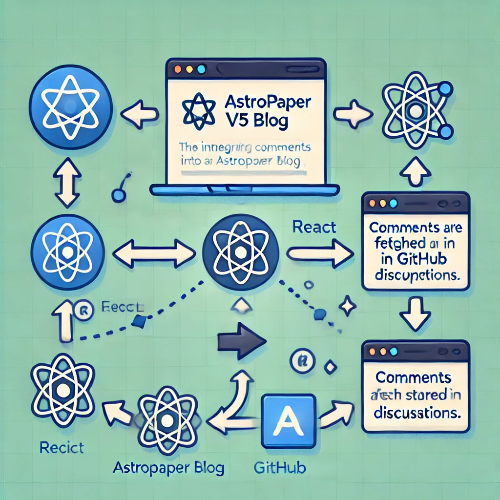
Integrating Giscus Comments in AstroPaper v5
Adding interactive comments to a static blog can be a challenge, but with Giscus, we can integrate GitHub-powered discussions into an AstroPaper v5 blog. This guide walks through the initial setup and fixes applied to make Giscus work correctly.
Step 1: Setting Up Giscus
- Go to giscus.app.
- Select the GitHub repository where discussions should be stored.
- Enable Discussions in the repository settings.
- Choose the preferred category (e.g.,
Announcements). - Copy the generated
<script>tag and embed it intosrc/layouts/PostDetails.astro:
<script
  src="https://giscus.app/client.js"
  data-repo="[ENTER REPO HERE]"
  data-repo-id="[ENTER REPO ID HERE]"
  data-category="[ENTER CATEGORY NAME HERE]"
  data-category-id="[ENTER CATEGORY ID HERE]"
  data-mapping="pathname"
  data-theme="preferred_color_scheme"
  crossorigin="anonymous"
  async
></script>
Step 2: Using the Giscus React Component
A better way to integrate Giscus is to use the React component, which allows seamless light/dark theme switching.
-
Install the Giscus React package:
npm install @giscus/react -
Create
src/components/Comments.tsx:import Giscus, { type Theme } from "@giscus/react"; import { useEffect, useState } from "react"; import { GISCUS } from "../config"; export default function Comments() { const [theme, setTheme] = useState<Theme>("light"); useEffect(() => { if (typeof window !== "undefined") { const storedTheme = localStorage.getItem("theme"); const systemTheme = window.matchMedia("(prefers-color-scheme: dark)").matches ? "dark" : "light"; setTheme(storedTheme || systemTheme); } }, []); return <Giscus theme={theme} {...GISCUS} />; } -
Define
GISCUSinsrc/config.ts:import type { GiscusProps } from "@giscus/react"; export const GISCUS: GiscusProps = { repo: "[ENTER REPO HERE]", repoId: "[ENTER REPO ID HERE]", category: "[ENTER CATEGORY NAME HERE]", categoryId: "[ENTER CATEGORY ID HERE]", mapping: "pathname", reactionsEnabled: "0", emitMetadata: "0", inputPosition: "bottom", lang: "en", loading: "lazy", }; -
Add
Comments.tsxtoPostDetails.astro:--- import Comments from "../components/Comments"; --- <Layout> <main> <ShareLinks /> <Comments client:load /> </main> </Layout>
Step 3: Fixing Common Issues
During the installation, we encountered and resolved several issues:
✅ Fix: localStorage is not defined error
- Solution: Wrap
localStorageinsideuseEffectto ensure it runs only in the browser.
✅ Fix: Cannot find module '@config' error
- Solution: Update the import to
import { GISCUS } from "../config";or set up aliases intsconfig.json.
✅ Fix: Astro hydration errors
- Solution: Use
<Comments client:load />to ensure React loads only on the client.
Conclusion
With these steps, we successfully integrated Giscus comments into AstroPaper v5 with full support for light/dark mode and seamless client-side hydration. If you run into any issues, drop a comment below—on Giscus! 🚀